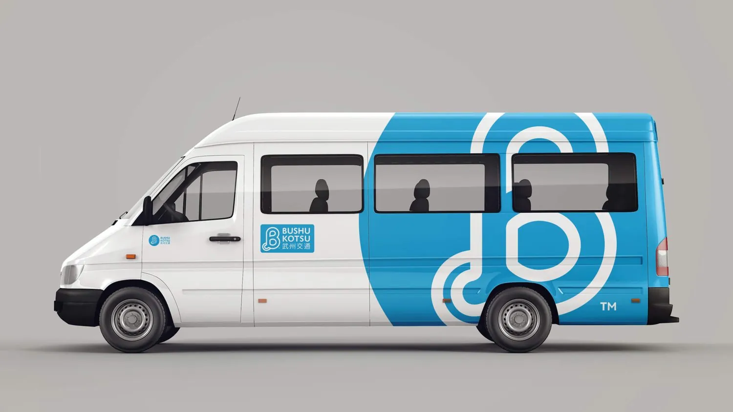
Bushu Kotsu — brand identity
← All work
Global Brand Reframe™ Mobility & Transport Japan

A modern identity,
built on trust

After a change in ownership, Bushu Kotsu needed to feel modern to younger riders while keeping the trust of conservative, long-standing customers.

Client

Bushu Kotsu — mobility services for elderly riders, families, and people with disabilities.

Engagement

Brand Strategy Brand Narrative Identity Design Naming

Sector

Sector

Mobility & Transport

Model

B2C Services

Market

Japan

Headline Result

A modernized identity that became a source of pride for the team and a symbol of trust for customers.

The Challenge

Modernize without alienating.

A change in ownership called for a refreshed identity, but the audience spanned younger riders and conservative, long-standing customers.

The outdated logo failed to resonate with a younger audience, while corporate and traditional clients still needed to feel at home.

The Approach

A careful, seven-phase rebrand.

A structured process

Brand audit, market research, strategy, visual identity (five logo concepts), internal alignment workshops, external communications, and rollout across digital and physical assets.

A calculated risk

We introduced English to the logo, a deliberate departure from the previous Kanji-only mark, and a confident sky-blue that signals trust and quality.

The Result

A symbol of trust and quality.

The new identity didn't just modernize Bushu Kotsu, it became a source of pride for its team and a symbol of trust and quality for its customers.

Time for a
brand that fits?